
At one point, I thought my living room just needed more space.
No matter how I arranged the furniture, something always felt slightly off.
The seating area blended into everything else. Storage didn’t have a clear place. Small items kept drifting into areas where they didn’t belong.
It didn’t feel like a size issue.
It felt like the space had no structure.
That’s when I stopped trying to fit more into the room and started looking at how the space was divided.
Once I introduced a few living room partitions with storage ideas, the difference became noticeable.
The room didn’t get bigger.
But it started behaving like it had more space.
I started noticing a similar pattern in other areas, too. Small spaces don’t always need more storage; they need better structure. I saw this clearly while working through a few small apartment storage tricks, where layout mattered more than capacity.
Why Living Rooms Start Feeling Disorganized Over Time
A living room rarely feels cluttered because of how much it holds.
It feels cluttered because everything shares the same visual field.
Seating, decor, storage, and sometimes even work areas all exist in one open layout. Without separation, items overlap visually and functionally.
There’s also no clear boundary between different uses.
Relaxation happens in the same area where items are stored. Movement paths cut through storage zones. Objects get placed temporarily and then stay there longer than expected.
Over time, this creates friction.
You move things more often. You adjust constantly. And even when everything is technically “in place,” it still feels unsettled.
What stood out to me is that the problem isn’t always how much the room holds.
I later realized this idea is closely tied to how layout affects daily use, and this guide on how to organize your home efficiently helped explain why better placement can make a space feel easier to manage without adding more storage.
It’s how everything is positioned within it.
15 Living Room Partitions With Storage Ideas
1. Using Open Shelving to Create Light Separation

At first, the room feels like one continuous surface.
There’s no moment where the eye pauses. Everything flows into everything else, which makes it harder to assign meaning to any specific area.
An open shelf divider changes that by introducing an interruption without blockage.
What stood out to me is how it creates partial separation.
You still see through it, but you no longer read the space as a single unit.
That small interruption reduces visual blending.
Storage plays a bigger role here than it seems.
When items sit inside shelves instead of across tables or sofas, they stop expanding outward. The divider becomes a containment line.
What makes this work over time is restraint.
If every shelf is filled, the divider turns into visual noise. But when spacing is controlled, the structure stays readable.
It’s less about adding storage and more about controlling where things are allowed to exist.
2. Creating a Full-Height Divider With Built-In Storage

Some spaces don’t respond well to soft separation.
They need a stronger boundary to stop everything from overlapping.
A full-height divider introduces that boundary in a very direct way.
It changes how the room is mentally divided.
Instead of one shared area, it becomes two distinct zones with their own purpose.
What I noticed is how this affects behavior.
Items naturally stop crossing over as much. Things placed on one side tend to stay there because the barrier makes movement slightly less convenient.
That small resistance helps maintain order.
The built-in storage is what stabilizes it further.
Instead of relying on separate storage units, everything integrates into the divider itself. This reduces the number of independent elements in the room.
Fewer elements mean fewer chances for clutter to spread.
And once the structure is strong enough, the space starts maintaining itself with less effort.
3. Positioning a TV Unit as a Divider Between Zones

The TV usually ends up against a wall because it feels like the safest placement.
But that often leaves the center of the room undefined.
When the unit is placed between zones, it starts shaping the layout instead of just sitting in it.
What changes first is movement.
People naturally move around the unit instead of through it. That shift creates two clear sides without needing additional boundaries.
The front becomes the viewing area.
The back becomes something else, dining, work, or circulation.
This separation happens without forcing it.
Storage inside the unit supports this shift.
Media items, cables, and smaller objects stay anchored to that central point. They stop spreading into other areas because they now have a fixed home.
What stood out to me is how this reduces “floating clutter.”
Items no longer sit temporarily on coffee tables or side surfaces. They return to the unit because it sits at the center of use.
This became clearer once I organized everything properly using a few TV and media storage ideas, where keeping electronics contained reduced how much they spread into the rest of the room.
4. Using Cube Storage to Introduce Defined Sections

Without clear divisions, storage tends to expand horizontally.
Items are spread side by side until they begin overlapping.
Cube storage interrupts that pattern.
Each compartment acts as a boundary. It limits how much can exist in one space.
What I found interesting is how this changes decision-making.
When a section is full, you’re forced to either reorganize it or stop adding more. That natural limit prevents slow accumulation.
It also reduces mixing.
Items stay grouped because each cube holds a specific category or function. They don’t drift into neighboring areas as easily.
Over time, this creates consistency.
This approach is similar to how structured layouts work in the living room cube storage ideas, where each section holds a defined role instead of expanding outward.
The system doesn’t rely on constant adjustment. The structure itself keeps things contained.
5. Combining Transparent and Solid Materials for Balance

Some dividers solve separation by blocking everything.
Others keep everything open but fail to create distinction.
A mix of transparent and solid elements sits in between.
What stood out to me is how this affects visual weight.
The transparent sections allow the eye to move through the space without interruption. This keeps the room from feeling smaller.
The solid sections slow that movement.
They introduce points where the eye pauses, which creates separation.
Storage usually sits within the solid parts.
This placement matters.
Because it keeps heavier, more detailed elements contained in areas that already interrupt the view. The transparent sections remain lighter and less cluttered.
That balance prevents the divider from feeling overwhelming while still doing its job.
6. Introducing Sliding Dividers That Adapt to Use

Fixed structures assume that the room will always be used the same way.
But that’s rarely the case.
A sliding divider changes based on need.
What stood out to me is how it reduces commitment.
You don’t have to choose between open and divided space permanently.
When open, everything flows together.
When closed, functions separate more clearly.
This flexibility reduces friction.
You don’t need to rearrange furniture or adjust storage every time your needs change.
Storage built into the panels adds another layer.
Because it moves with the divider, it doesn’t disrupt the layout. Items stay within the same system even as the space shifts.
That consistency helps maintain order, even when the room changes throughout the day.
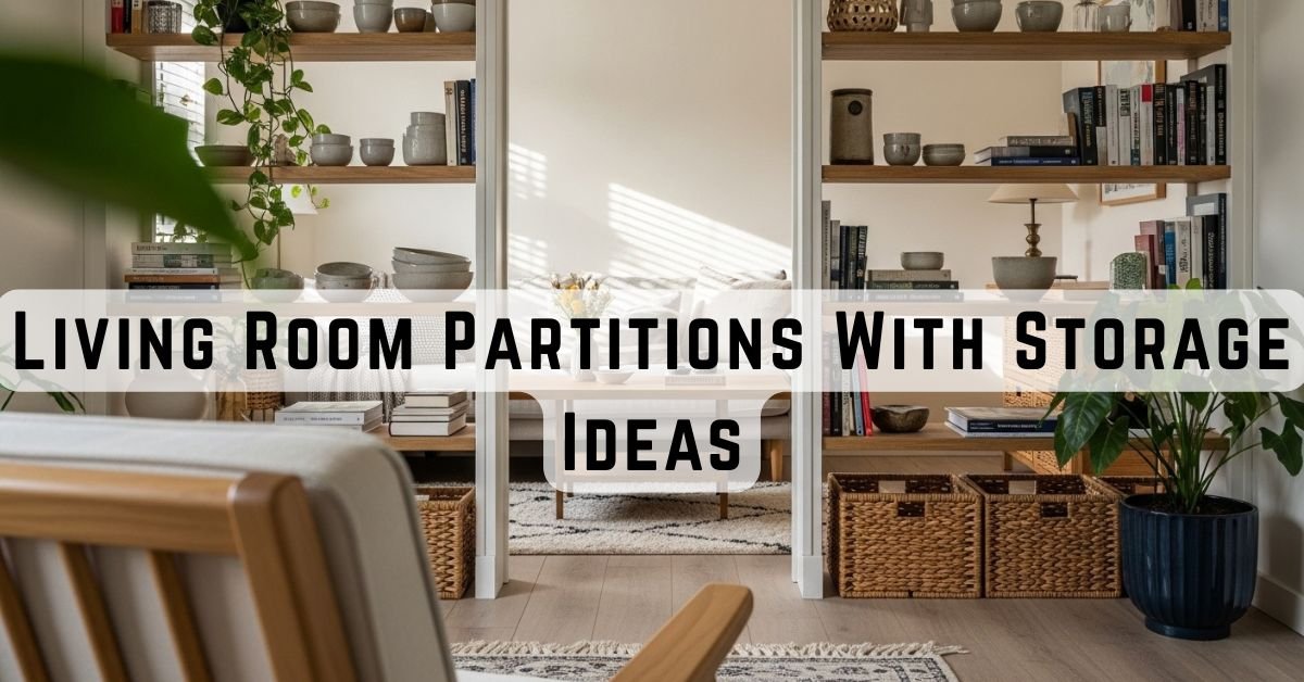
7. Using a Bookshelf to Anchor and Divide the Space

A bookshelf does more than store items.
It introduces a vertical structure that the room can organize around.
When placed between zones, it creates a stopping point.
The eye no longer moves freely across the entire room. It pauses at the shelf, then continues.
That pause creates separation.
What I noticed is how this affects placement.
Items tend to stay closer to the shelf because it acts as a reference point. Instead of spreading randomly, they cluster around it.
Storage within the shelf supports this behavior.
It absorbs items that would otherwise sit on surrounding surfaces.
Over time, this reduces how much the rest of the room has to handle.
The divider becomes both a boundary and a stabilizing element.
8. Adding Vertical Slats With Storage at the Base

Some spaces don’t need full visual blockage to feel separated.
They just need a shift in pattern.
Vertical slats introduce that shift through repetition.
What stood out to me is how they guide attention.
Instead of seeing everything at once, your view gets filtered through the spacing between slats.
That alone reduces how connected different zones feel.
But the structure would feel incomplete without the base.
The storage at the bottom carries most of the functional load.
Items that usually sit out, small clutter, loose objects get absorbed there. This keeps the upper section visually light.
That balance matters.
Because when the top stays open and the bottom stays contained, the divider separates without adding weight.
9. Building a Half-Height Divider With Storage

Not every separation needs to reach the ceiling.
In many cases, most of the overlap happens at the mid-level.
A half-height divider targets that exact zone.
What changes here is how surfaces behave.
Without a boundary, items move freely across tables, sofas, and nearby areas. But once a mid-level structure is introduced, that movement slows down.
It creates a subtle stop.
Storage built into this height captures items before they spread further.
At the same time, the upper part of the room remains open.
This keeps the space from feeling divided too aggressively.
It’s a controlled form of separation enough to guide behavior, but not enough to restrict the room.
10. Pairing Soft Dividers With Hidden Storage

Soft dividers don’t create structure on their own.
They shift visibility, not placement.
That’s why they work better when paired with storage behind them.
What stood out to me is how this combination separates two roles.
The storage handles organization.
The divider controls what is seen.
This reduces pressure on both.
The storage doesn’t need to look perfect, because it’s partially hidden. And the divider doesn’t need to carry weight, because it’s not responsible for holding anything.
This setup works especially well in spaces where flexibility matters.
You can reveal or hide sections depending on the situation, without changing the underlying system.
11. Using Lightweight Frames With Integrated Shelving

Heavy structures solve separation by adding mass.
Lightweight frames do it through outline.
They define space using lines instead of solid surfaces.
What I noticed is how this changes perception.
The frame creates a boundary that’s visible, but not dominant. You’re aware of it, but it doesn’t interrupt the entire view.
Shelving within the frame adds function.
Items stay contained within those lines instead of spreading outward.
Because the structure remains open, the room keeps its depth.
This prevents the divider from feeling like an obstacle while still guiding how the space is used.
12. Allowing Rotation to Change How the Space Functions

Most layouts assume stability.
Everything stays in place, and the room adapts around that.
A rotating divider shifts that idea.
It allows the structure itself to change orientation.
What stood out to me is how this affects flow.
When the divider turns, it redirects movement. It changes what’s visible and what’s accessible.
The same space starts behaving differently without adding or removing anything.
Storage within the unit remains consistent.
That consistency is important.
Even though the layout shifts, items still return to the same place. This keeps the system stable while allowing flexibility.
13. Using a Bench as a Low Divider With Storage

Separation doesn’t always need to happen at eye level.
In many cases, defining the floor-level boundary is enough.
A bench does this quietly.
It creates a horizontal break between zones without interrupting the entire space.
What I noticed is how this affects movement.
Instead of walking straight through an area, you move around it. That slight redirection creates a sense of division.
Storage inside the bench supports this by removing items from the floor.
This matters more than it seems.
Because once the lower area is clear, the entire room feels more open and easier to navigate.
This setup connects closely with how benches and ottomans for the living room work, where seating and storage combine without taking extra space.
14. Introducing Vertical Storage in Narrow Forms

When space is limited, width becomes the first constraint.
Anything too wide starts interfering with movement.
A narrow vertical divider works within that limitation.
It creates separation without expanding across the floor.
What stood out to me is how it shifts storage upward.
Items stack vertically instead of spreading horizontally. This keeps the footprint small.
It also reduces interference.
Because the divider doesn’t occupy much width, it doesn’t interrupt pathways or seating arrangements.
The structure stays present, but not intrusive.
15. Using Closed Storage to Reduce Visual Noise

Visibility plays a larger role than expected.
Even when items are organized, seeing too many of them at once can make the space feel crowded.
Closed storage removes that layer.
What changes here is how the room is processed visually.
Instead of reading multiple objects, the eye sees a single surface.
That simplification reduces mental load.
This is closely related to a few hidden storage ideas, where reducing visibility makes the entire space feel calmer without removing functionality.
Storage still exists, but it no longer competes with the rest of the room.
This becomes especially useful in spaces where multiple functions overlap.
Because when fewer things are visible, the boundaries between those functions feel clearer.
Additional Adjustments That Make These Setups Work Better
What I noticed is that adding structure alone isn’t enough.
How the storage is used also matters.
One adjustment that helped was limiting how many items sit in open areas. When too many objects remain visible, even a well-divided space starts to feel busy again.
Another change was aligning storage with the frequency of use.
Items I use daily stay within easy reach. Less-used items move slightly out of the way. This reduces how often things get shifted around.
I also started paying attention to movement.
If I have to move something to access something else, that’s usually a sign the placement needs adjustment.
Small changes like these don’t seem significant at first.
But over time, they reduce friction.
What Actually Changes When the Space Is Divided Properly
What stood out to me is that none of these ideas increases the size of the room.
But they change how the space behaves.
Items stop overlapping.
Functions stop interfering with each other.
Movement becomes more direct.
That reduction in friction is what creates the feeling of more space.
Final Thoughts
What changed for me wasn’t how much I could place in the living room.
It was how clearly the space started to behave.
Once boundaries were introduced, even subtle ones, things stopped drifting. Storage stayed contained. Surfaces stayed more consistent. And the room no longer felt like something I had to keep correcting.
That’s where living room partitions with storage made the biggest difference.
It didn’t add more space in a physical sense. But it reduced overlap, clarified where things belong, and made each area easier to use without constant adjustment.
And once that clarity is in place, the room starts to hold its structure on its own.
Not because there’s less in it.
But because everything finally has a place that works.